Best Design Practices for WordPress Contact Forms
What can be easier than implementing a contact form on your WordPress website, right? Wrong.
To be more precise, you can easily build a needed form with a WordPress form builder plugin, but since it gives so much customization freedom, taking care of design aspects and UX doesn’t come easy.
You may not realize that, but for users, your form can be too long, unreadable, hard on the eyes, broken down, unsafe, CAPTCHA-stressful, unclear, too time-consuming to fill out, annoying, etc.
The horrible UX of a sloppy web form can actually be the reason for drop in conversion or lead registration on your WordPress website. You don’t want to create such a beast with your own hands, do you?
If you deal with really complex registration forms, such as job application or survey ones, there may be lots of design pitfalls. Recognizing those barriers is the first step to improving the form submission rate on your website.
You got the idea: UX is vital. And since it usually deals with typical human psychology tasks, you can improve the UX of your WordPress forms. If you just start building your form and have vanilla design skills, our guide will help you notice important UX details and utilize them properly in your WordPress form.
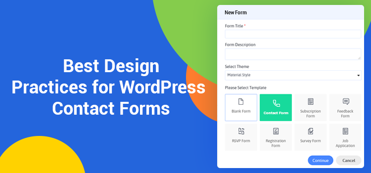
Jumping ahead a little bit, you should know that a free version of the ARForms WordPress plugin comes with a collection of beautiful pre-designed form templates for any occasion that you can download for free. We’ll use some of them as examples in this article.
There are so many reasons affecting form completion. We’ll talk about major components of a form and how to optimize each following the best contact form design practices.
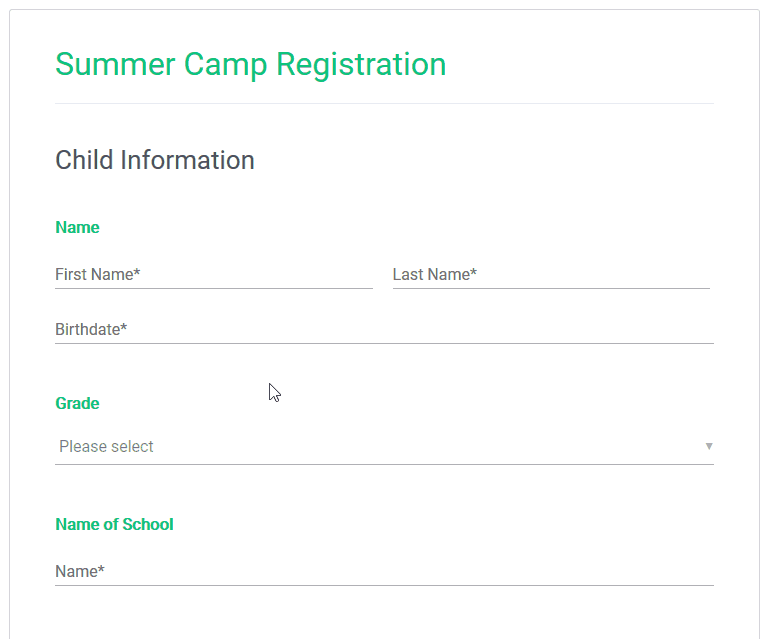
For long complex forms (surveys, platform registration forms), it’s crucial that users get a feeling of progress and accomplishment when they fill out such a form.
There are several actionable ways to deal with long forms:

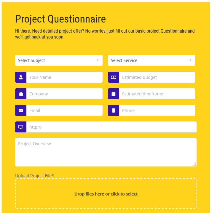
2. Split the form visually into semantic groups. This is a similar approach, but unlike multi-page form, it gives users a clear idea of the whole form complexity outright. To make a complex form visually divided into several discrete groups, highlight the titles of separate semantic sections: make bold headers, increase the font size, change font weight or change all characters to uppercase, etc. Make it a simple ABC process for people.
As an example, you may download a premium sample “Summer Camp Registration” form and use it with your ARForms WordPress contact form plugin.

Too many fields. This is one of the major reasons for the form friction. People won’t fill out the form with too many unnecessary or suspicious, in their opinion, fields.
Try to reduce the number of unnecessary fields if possible or at least mark those fields as optional.
Of course, if that extra info is required, you may need to perform an A/B test to experiment with the best fields placement and form structure.
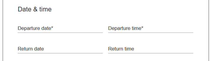
One field per row is the perfect balance for both people’s eyes and mobile devices. It helps users concentrate and fill out the form bit by bit easier.
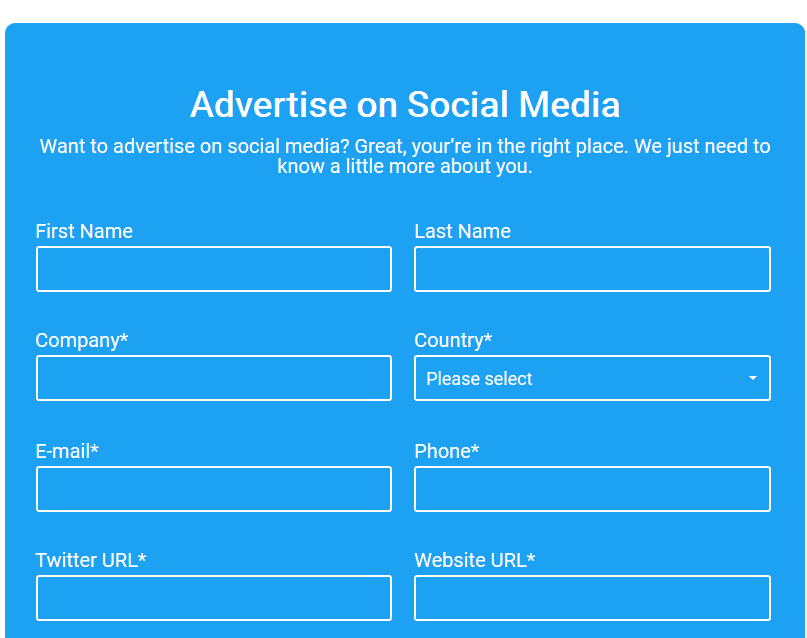
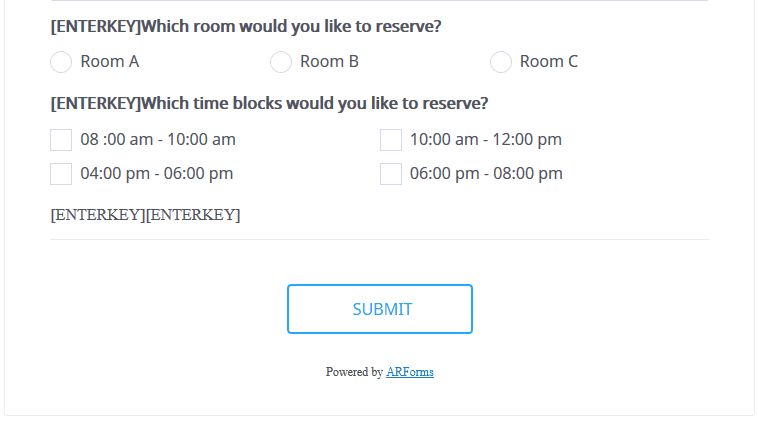
However, it’s acceptable to use several fields in a row in case they are semantically connected:

They are the most informative part of your form so you should be maximum specific and short about information required. Avoid ambiguity so that users are not forced to wreck their brains around what should be placed into any given field.
What’s the best placement of the field labels in terms of the UX – above the form field or using placeholders? The short answer is both ways are acceptable, but the former is better. There are a couple of reasons why.
According to the best practices of material design, the text labels should always be visible. Labels above the form field look cleaner and usually perform better on mobile devices.

However, with placeholders, when users put in the data and a placeholder disappears, that can be really confusing. Users can forget what info should be placed and would need to do it all over again. Furthermore, in many cases, placeholders can complicate the process of final form revision for errors before submission. One more not that obvious disadvantage is that navigating with the keyboard can be a real pain since the placeholder titles disappear before the user even reads the title. You don’t want to impose that extra stress on your user, do you?
You can try to improve the UX a little bit using leading icons as in the example below, but they still can’t completely substitute the always visible titles.

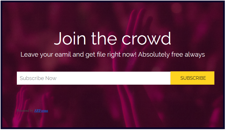
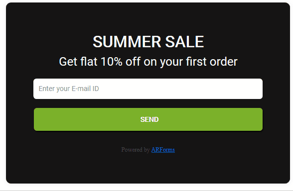
Despite those facts, there won’t be any problems with placeholders if you use them for small one or two-field forms, such as newsletter subscription:

But there is also a sweet spot – in-field top-aligned labels.
These are animated labels that stay visible even when a user starts typing in the field container. They take less page space and at the same time are highly user-friendly, so this is one of the most used contact form design approaches in this time and day. Especially long and complex contact forms can benefit from this design solution.

To conclude, placeholder labels are great for small and easy forms like newsletter subscriptions, while labels above the field and in-field top-aligned labels are the best way to go for complex, long forms of different types.
All users of the premium ARForms WordPress contact form builder plugin can download pre-designed contact form templates that use different types of labels.
There is always a risk to create an inconsistent form design. And a spacing inconsistency is among the most common problems.
For example, if you use incorrect spacing for the field helper text, which is usually put underneath the field container, users can confuse the field the helper text belongs to. If you don’t want to tinker your way into a visual mess, don’t overdo with manual fields spacing adjustments.
The main rule is be consistent in applying form spacing.
Choosing typography for your forms shouldn’t be difficult. Preferably stick to the global website font, optionally change a font weight and size to highlight the field labels or separate semantic groups.
The form submission buttons hold the main action emphasis, so the action text should be clear. From the design aspect, the following types of buttons perform the best:


You can align the buttons to the left, right or center depending on the width of your form and your personal preferences. In the vast majority of cases, the uppercase for button labels is the best way to go.
For marketing-oriented forms, you can come up with more creative button abels instead of the usual “Submit” or “Send”. However, for the sake of visual clarity, avoid text labels that are too long.
The main purpose of the colors in forms is to ensure the text is perfectly readable.
If you choose the color scheme yourself, keep in mind the following tips:
 4. Strive to simplicity: use classic black, white and grey colors. But if you want to go with a black color scheme, don’t let it be pure black since it can be a real pain for eyes:

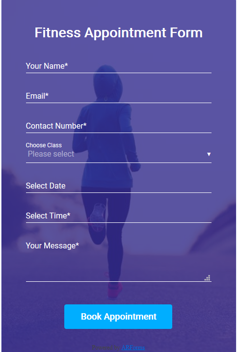
If you want to impress your audience and look more engaging for potential customers, use catchy images – either for background or as an introductory image. Be sure to get them right – images must not distract or overlap the form. Increase the background image opacity or add a solid background color to the form container and put the form over the image.

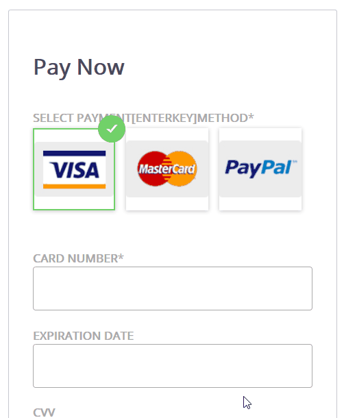
In some cases, picture choice answers make options easier to grasp (it’s a matter of clicks to add those via ARForms plugin). This is also a great tool to break up the monotony of a form.

It’s a good practice to apply not more than three custom colors, generally to the input text, label text and container. For example, here is how the Crane travel app adapts this technique using material design:

If you want to provide more information for any field, make sure a helper text is clearly attached to the needed field so that users are not confused about the field the helper text belongs to. This can be taken care of with the correct spacing – the space between field containers should be bigger than between a helper text and container.
If you ask for sensitive info in your forms, especially if it’s intended to unlock any sort of paywall on your website, you should be really careful. As a rule, people don’t share this information if they are not sure it’s important, e.g. users are not eager to provide credit card details when registering a trial account.
For example, seeing low signup rate with the credit card info required, CrazyEgg company found out that the visitors were scared to provide this info. So the company created and tested another signup page ensuring that no automatic charges will take place: this improvement resulted in a 116% increase in trial signups.
Imagine you are filling out a long form for five minutes and, finally, instead of clicking a button, you have to solve a blurry captcha. It goes without saying that anti-spam technology is crucial for any website interaction, but you should implement it the right way. For example, reCAPTCHA mechanism by Google will provide a smooth user experience for your prospects.
Hopefully, our guide will give you some pointers on how to turn your website forms from a pain to an effective communication and marketing solution. Most of those tips provide quick-fix solutions, however, testing is key to see which approach is best for you.
Adhere these best contact form UX practices and you’ll help users fill out the form on your WordPress website as quick and easy as possible. If you want to get more automated in this process, download our free form templates for ARForms WordPress contact form plugin to utilize in your forms and look really professional.
To be more precise, you can easily build a needed form with a WordPress form builder plugin, but since it gives so much customization freedom, taking care of design aspects and UX doesn’t come easy.
You may not realize that, but for users, your form can be too long, unreadable, hard on the eyes, broken down, unsafe, CAPTCHA-stressful, unclear, too time-consuming to fill out, annoying, etc.
The horrible UX of a sloppy web form can actually be the reason for drop in conversion or lead registration on your WordPress website. You don’t want to create such a beast with your own hands, do you?
If you deal with really complex registration forms, such as job application or survey ones, there may be lots of design pitfalls. Recognizing those barriers is the first step to improving the form submission rate on your website.
You got the idea: UX is vital. And since it usually deals with typical human psychology tasks, you can improve the UX of your WordPress forms. If you just start building your form and have vanilla design skills, our guide will help you notice important UX details and utilize them properly in your WordPress form.
Jumping ahead a little bit, you should know that a free version of the ARForms WordPress plugin comes with a collection of beautiful pre-designed form templates for any occasion that you can download for free. We’ll use some of them as examples in this article.
There are so many reasons affecting form completion. We’ll talk about major components of a form and how to optimize each following the best contact form design practices.
How to deal with long forms
For long complex forms (surveys, platform registration forms), it’s crucial that users get a feeling of progress and accomplishment when they fill out such a form.
There are several actionable ways to deal with long forms:
- Break the form into several steps: this will help decrease mental workflow of filling in the form, help people get focused and make them less prone to errors.
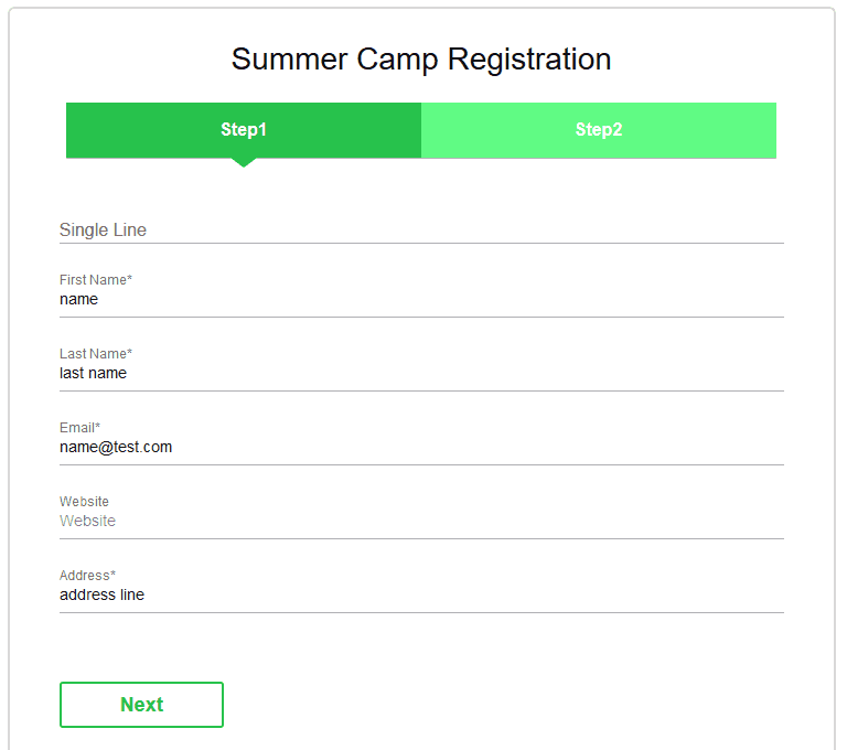
2. Split the form visually into semantic groups. This is a similar approach, but unlike multi-page form, it gives users a clear idea of the whole form complexity outright. To make a complex form visually divided into several discrete groups, highlight the titles of separate semantic sections: make bold headers, increase the font size, change font weight or change all characters to uppercase, etc. Make it a simple ABC process for people.
As an example, you may download a premium sample “Summer Camp Registration” form and use it with your ARForms WordPress contact form plugin.
The number of fields: the fewer, the better
Too many fields. This is one of the major reasons for the form friction. People won’t fill out the form with too many unnecessary or suspicious, in their opinion, fields.
Try to reduce the number of unnecessary fields if possible or at least mark those fields as optional.
Of course, if that extra info is required, you may need to perform an A/B test to experiment with the best fields placement and form structure.
The number of columns
One field per row is the perfect balance for both people’s eyes and mobile devices. It helps users concentrate and fill out the form bit by bit easier.
However, it’s acceptable to use several fields in a row in case they are semantically connected:
Field labels
They are the most informative part of your form so you should be maximum specific and short about information required. Avoid ambiguity so that users are not forced to wreck their brains around what should be placed into any given field.
What’s the best placement of the field labels in terms of the UX – above the form field or using placeholders? The short answer is both ways are acceptable, but the former is better. There are a couple of reasons why.
According to the best practices of material design, the text labels should always be visible. Labels above the form field look cleaner and usually perform better on mobile devices.
However, with placeholders, when users put in the data and a placeholder disappears, that can be really confusing. Users can forget what info should be placed and would need to do it all over again. Furthermore, in many cases, placeholders can complicate the process of final form revision for errors before submission. One more not that obvious disadvantage is that navigating with the keyboard can be a real pain since the placeholder titles disappear before the user even reads the title. You don’t want to impose that extra stress on your user, do you?
You can try to improve the UX a little bit using leading icons as in the example below, but they still can’t completely substitute the always visible titles.
Despite those facts, there won’t be any problems with placeholders if you use them for small one or two-field forms, such as newsletter subscription:
But there is also a sweet spot – in-field top-aligned labels.
These are animated labels that stay visible even when a user starts typing in the field container. They take less page space and at the same time are highly user-friendly, so this is one of the most used contact form design approaches in this time and day. Especially long and complex contact forms can benefit from this design solution.
To conclude, placeholder labels are great for small and easy forms like newsletter subscriptions, while labels above the field and in-field top-aligned labels are the best way to go for complex, long forms of different types.
All users of the premium ARForms WordPress contact form builder plugin can download pre-designed contact form templates that use different types of labels.
Keep consistency in spacing
There is always a risk to create an inconsistent form design. And a spacing inconsistency is among the most common problems.
For example, if you use incorrect spacing for the field helper text, which is usually put underneath the field container, users can confuse the field the helper text belongs to. If you don’t want to tinker your way into a visual mess, don’t overdo with manual fields spacing adjustments.
The main rule is be consistent in applying form spacing.
Typography
Choosing typography for your forms shouldn’t be difficult. Preferably stick to the global website font, optionally change a font weight and size to highlight the field labels or separate semantic groups.
Form buttons
The form submission buttons hold the main action emphasis, so the action text should be clear. From the design aspect, the following types of buttons perform the best:
- Contained buttons (when the button is interacted with, its container changes to a different color).
- Outlined buttons (when the button is interacted with, its container changes from transparent to colored).
You can align the buttons to the left, right or center depending on the width of your form and your personal preferences. In the vast majority of cases, the uppercase for button labels is the best way to go.
For marketing-oriented forms, you can come up with more creative button abels instead of the usual “Submit” or “Send”. However, for the sake of visual clarity, avoid text labels that are too long.
Contact form colors, background and images
The main purpose of the colors in forms is to ensure the text is perfectly readable.
If you choose the color scheme yourself, keep in mind the following tips:
- Make sure it fits in your current website design and doesn’t look like an alien piece.
- Choose background colors that reduce the eye strain. Lower brightness and saturation levels are more pleasant for eyes than harsh maximum brightness and saturation.
- Use complementary colors – have any color combinations collection at hand.
 4. Strive to simplicity: use classic black, white and grey colors. But if you want to go with a black color scheme, don’t let it be pure black since it can be a real pain for eyes:
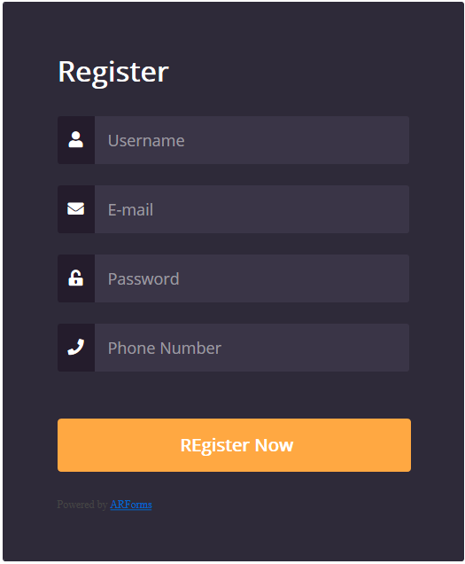
If you want to impress your audience and look more engaging for potential customers, use catchy images – either for background or as an introductory image. Be sure to get them right – images must not distract or overlap the form. Increase the background image opacity or add a solid background color to the form container and put the form over the image.
In some cases, picture choice answers make options easier to grasp (it’s a matter of clicks to add those via ARForms plugin). This is also a great tool to break up the monotony of a form.
It’s a good practice to apply not more than three custom colors, generally to the input text, label text and container. For example, here is how the Crane travel app adapts this technique using material design:
Add helper text when needed
If you want to provide more information for any field, make sure a helper text is clearly attached to the needed field so that users are not confused about the field the helper text belongs to. This can be taken care of with the correct spacing – the space between field containers should be bigger than between a helper text and container.
Be careful with sensitive info
If you ask for sensitive info in your forms, especially if it’s intended to unlock any sort of paywall on your website, you should be really careful. As a rule, people don’t share this information if they are not sure it’s important, e.g. users are not eager to provide credit card details when registering a trial account.
For example, seeing low signup rate with the credit card info required, CrazyEgg company found out that the visitors were scared to provide this info. So the company created and tested another signup page ensuring that no automatic charges will take place: this improvement resulted in a 116% increase in trial signups.
Use smart CAPTCHA
Imagine you are filling out a long form for five minutes and, finally, instead of clicking a button, you have to solve a blurry captcha. It goes without saying that anti-spam technology is crucial for any website interaction, but you should implement it the right way. For example, reCAPTCHA mechanism by Google will provide a smooth user experience for your prospects.
Final word on the WordPress contact form UX
Hopefully, our guide will give you some pointers on how to turn your website forms from a pain to an effective communication and marketing solution. Most of those tips provide quick-fix solutions, however, testing is key to see which approach is best for you.
Adhere these best contact form UX practices and you’ll help users fill out the form on your WordPress website as quick and easy as possible. If you want to get more automated in this process, download our free form templates for ARForms WordPress contact form plugin to utilize in your forms and look really professional.